
Parce que même vos applications méritent un peu de magie de Noël…
Et si vous pouviez leur appliquer un thème Noël pour formulaires K2 sans effort ?
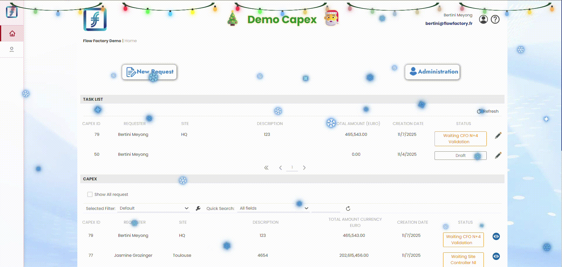
Dans cet article, je vous partage un thème CSS pur (sans JavaScript !) qui transforme n’importe quel formulaire K2 en carte postale de Noël. Au programme : neige qui tombe, guirlandes lumineuses animées, et titre de page scintillant.
Le tout en 5 minutes chrono.
Ce que contient ce thème
Neige qui tombe
30 flocons animés avec différentes tailles, vitesses et trajectoires. Un mix de flocons blancs (avec halo bleu pour la visibilité) et de flocons bleus pour un effet givré même sur fond clair.
Guirlande lumineuse
Une guirlande suspendue en haut de page avec un fil en courbe naturelle (effet « swooping »). 25 ampoules multicolores (rouge, vert, bleu, jaune, orange) avec une animation séquentielle en vague comme les vraies !
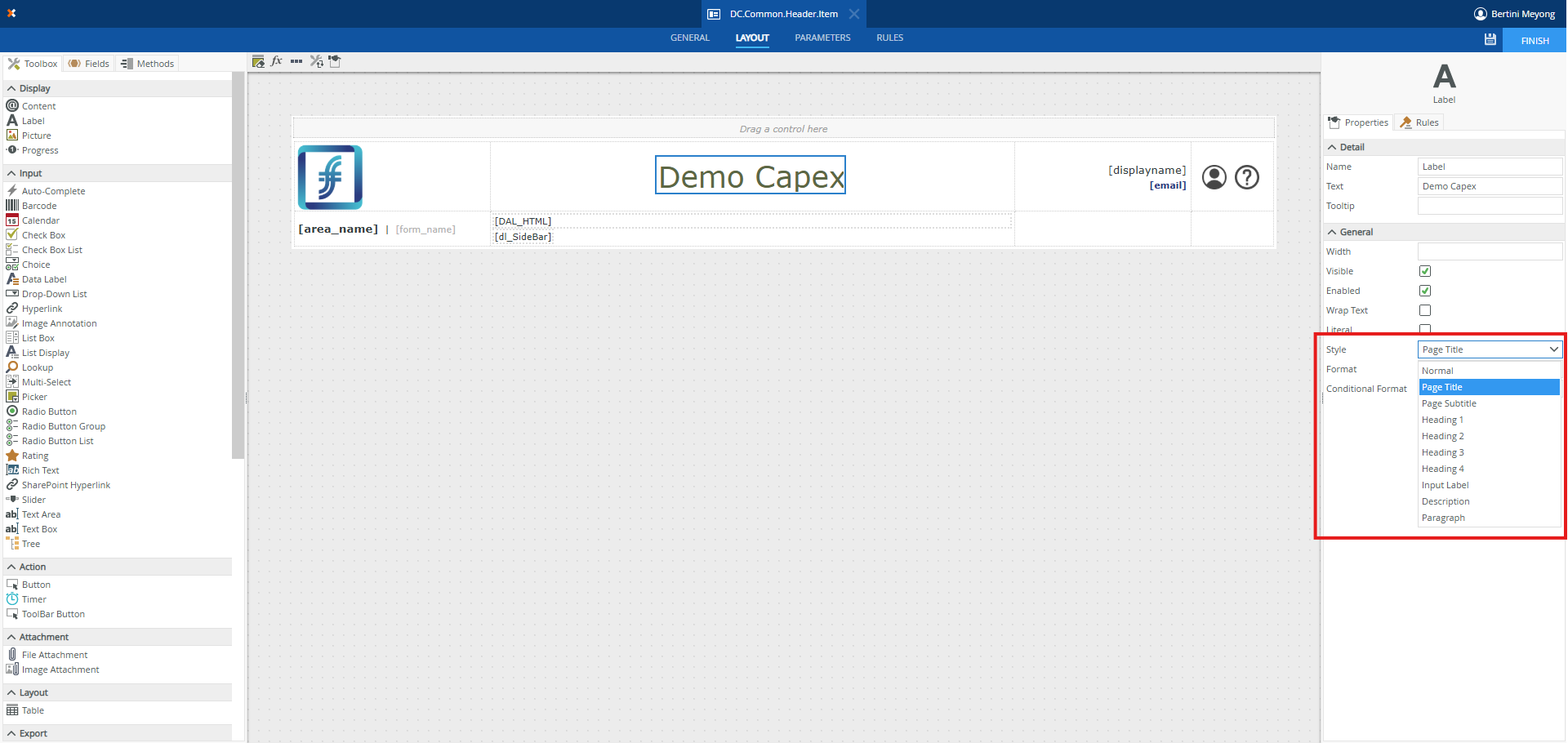
Titre festif
Votre titre de page s’illumine avec un effet scintillant doré, encadré par un sapin 🎄 et un Père Noël 🎅 qui flottent doucement.
NB : Cette mise en forme ne s’applique que sur les Labels avec le style Page Title
Intégration dans K2 (4 étapes)
Pas besoin de toucher au code source ou de déployer quoi que ce soit. Tout passe par une astuce simple avec un Data Label.
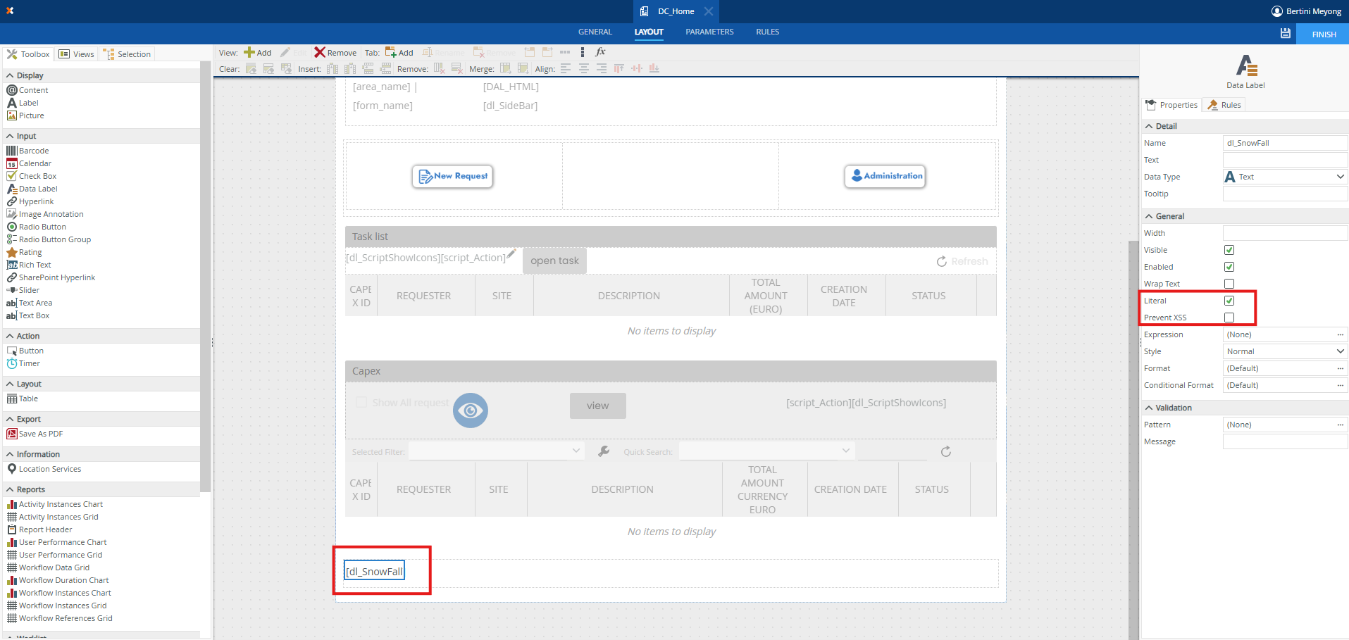
Étape 1 : Créer un Data Label
Dans votre Formulaire, ajoutez un contrôle Data Label n’importe où sur le formulaire.
Dans les propriétés :
- Cochez « Literal » pour permettre le rendu HTML
- Décochez « Prevent XSS » pour autoriser les balises style
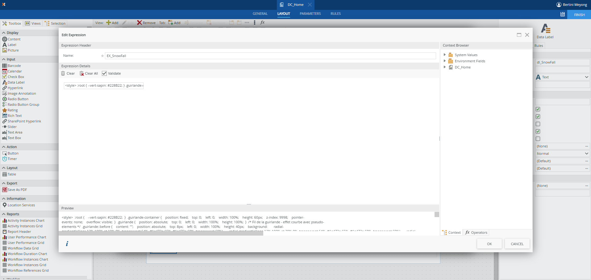
Étape 2 : Créer une Expression
Allez dans l’éditeur d’expression (FX) et créez une nouvelle expression. Collez-y l’intégralité du code CSS + HTML fourni ci-dessous.
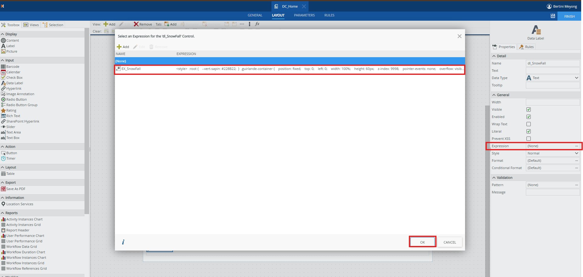
Étape 3 : Associer l’expression au Data Label
Toujours dans les propriétés du Data Label, associez votre expression au champ « Expression » ou créez une règle qui assigne l’expression au Data Label au chargement du formulaire avec un transfer data.
Étape 4 : Enjoy ! 🎉
Enregistrez, publiez, et admirez la magie opérer !
Le code complet
Copiez-collez ce code dans votre expression K2 :
:root {
--vert-sapin: #228B22;
}
.guirlande-container {
position: fixed;
top: 0;
left: 0;
width: 100%;
height: 60px;
z-index: 9998;
pointer-events: none;
overflow: visible;
}
.guirlande {
position: absolute;
top: 0;
left: 0;
width: 100%;
height: 100%;
}
/* Fil de la guirlande - effet courbe avec pseudo-elements */
.guirlande::before {
content: "";
position: absolute;
top: 8px;
left: 0;
width: 100%;
height: 40px;
background:
radial-gradient(ellipse 12% 100% at 10% 0%, transparent 64%, #1a472a 65%, #1a472a 68%, transparent 69%),
radial-gradient(ellipse 12% 100% at 30% 0%, transparent 64%, #1a472a 65%, #1a472a 68%, transparent 69%),
radial-gradient(ellipse 12% 100% at 50% 0%, transparent 64%, #1a472a 65%, #1a472a 68%, transparent 69%),
radial-gradient(ellipse 12% 100% at 70% 0%, transparent 64%, #1a472a 65%, #1a472a 68%, transparent 69%),
radial-gradient(ellipse 12% 100% at 90% 0%, transparent 64%, #1a472a 65%, #1a472a 68%, transparent 69%);
}
/* Ampoules */
.ampoule {
position: absolute;
width: 12px;
height: 16px;
border-radius: 50% 50% 50% 50% / 60% 60% 40% 40%;
top: 35px;
animation: glow-sequence 2s ease-in-out infinite;
}
.ampoule::before {
content: "";
position: absolute;
top: -4px;
left: 50%;
transform: translateX(-50%);
width: 6px;
height: 6px;
background: #2d2d2d;
border-radius: 2px 2px 0 0;
}
/* Couleurs des ampoules */
.ampoule.rouge { background: #ff3333; box-shadow: 0 0 10px #ff3333, 0 0 20px #ff3333; }
.ampoule.vert { background: #33cc33; box-shadow: 0 0 10px #33cc33, 0 0 20px #33cc33; }
.ampoule.bleu { background: #3399ff; box-shadow: 0 0 10px #3399ff, 0 0 20px #3399ff; }
.ampoule.jaune { background: #ffcc00; box-shadow: 0 0 10px #ffcc00, 0 0 20px #ffcc00; }
.ampoule.orange { background: #ff9933; box-shadow: 0 0 10px #ff9933, 0 0 20px #ff9933; }
/* Animation séquentielle - vague */
@keyframes glow-sequence {
0%, 100% { opacity: 0.4; filter: brightness(0.6); }
50% { opacity: 1; filter: brightness(1.3); }
}
/* Positionnement sur les courbes - 25 ampoules */
.ampoule:nth-child(1) { left: 2%; top: 20px; animation-delay: 0s; }
.ampoule:nth-child(2) { left: 6%; top: 30px; animation-delay: 0.1s; }
.ampoule:nth-child(3) { left: 10%; top: 38px; animation-delay: 0.2s; }
.ampoule:nth-child(4) { left: 14%; top: 32px; animation-delay: 0.3s; }
.ampoule:nth-child(5) { left: 18%; top: 22px; animation-delay: 0.4s; }
.ampoule:nth-child(6) { left: 22%; top: 20px; animation-delay: 0.5s; }
.ampoule:nth-child(7) { left: 26%; top: 30px; animation-delay: 0.6s; }
.ampoule:nth-child(8) { left: 30%; top: 38px; animation-delay: 0.7s; }
.ampoule:nth-child(9) { left: 34%; top: 32px; animation-delay: 0.8s; }
.ampoule:nth-child(10) { left: 38%; top: 22px; animation-delay: 0.9s; }
.ampoule:nth-child(11) { left: 42%; top: 20px; animation-delay: 1s; }
.ampoule:nth-child(12) { left: 46%; top: 30px; animation-delay: 1.1s; }
.ampoule:nth-child(13) { left: 50%; top: 38px; animation-delay: 1.2s; }
.ampoule:nth-child(14) { left: 54%; top: 32px; animation-delay: 1.3s; }
.ampoule:nth-child(15) { left: 58%; top: 22px; animation-delay: 1.4s; }
.ampoule:nth-child(16) { left: 62%; top: 20px; animation-delay: 1.5s; }
.ampoule:nth-child(17) { left: 66%; top: 30px; animation-delay: 1.6s; }
.ampoule:nth-child(18) { left: 70%; top: 38px; animation-delay: 1.7s; }
.ampoule:nth-child(19) { left: 74%; top: 32px; animation-delay: 1.8s; }
.ampoule:nth-child(20) { left: 78%; top: 22px; animation-delay: 1.9s; }
.ampoule:nth-child(21) { left: 82%; top: 20px; animation-delay: 2s; }
.ampoule:nth-child(22) { left: 86%; top: 30px; animation-delay: 2.1s; }
.ampoule:nth-child(23) { left: 90%; top: 38px; animation-delay: 2.2s; }
.ampoule:nth-child(24) { left: 94%; top: 32px; animation-delay: 2.3s; }
.ampoule:nth-child(25) { left: 98%; top: 22px; animation-delay: 2.4s; }
.snow-container {
position: fixed;
top: 0;
left: 0;
width: 100%;
height: 100%;
pointer-events: none;
z-index: 9999;
overflow: hidden;
}
/* Flocons blancs avec contour/ombre bleu pour visibilité */
.snowflake {
position: absolute;
top: -80px;
color: #fff;
user-select: none;
animation-timing-function: linear;
animation-iteration-count: infinite;
text-shadow:
0 0 3px #4a90d9,
0 0 6px #4a90d9,
0 0 10px #6ab0ff,
0 0 15px #6ab0ff,
1px 1px 2px rgba(0, 80, 180, 0.8),
-1px -1px 2px rgba(0, 80, 180, 0.8);
filter: drop-shadow(0 0 4px rgba(74, 144, 217, 0.9));
}
/* Flocons bleus */
.snowflake.bleu {
color: #5cacee;
text-shadow:
0 0 5px #2171b5,
0 0 10px #2171b5,
0 0 15px #4a90d9,
0 0 20px #6ab0ff,
1px 1px 3px rgba(0, 60, 140, 0.9),
-1px -1px 3px rgba(0, 60, 140, 0.9);
filter: drop-shadow(0 0 6px rgba(33, 113, 181, 1));
}
/* Flocons bleu clair */
.snowflake.bleu-clair {
color: #87ceeb;
text-shadow:
0 0 4px #4682b4,
0 0 8px #4682b4,
0 0 12px #5cacee,
1px 1px 2px rgba(0, 70, 150, 0.8),
-1px -1px 2px rgba(0, 70, 150, 0.8);
filter: drop-shadow(0 0 5px rgba(70, 130, 180, 0.9));
}
@keyframes snowfall-1 {
0% { transform: translateY(-80px) translateX(0) rotate(0deg); opacity: 0; }
10% { opacity: 1; }
90% { opacity: 1; }
100% { transform: translateY(100vh) translateX(40px) rotate(360deg); opacity: 0; }
}
@keyframes snowfall-2 {
0% { transform: translateY(-80px) translateX(0) rotate(0deg); opacity: 0; }
10% { opacity: 1; }
50% { transform: translateY(50vh) translateX(-30px) rotate(180deg); }
90% { opacity: 1; }
100% { transform: translateY(100vh) translateX(15px) rotate(360deg); opacity: 0; }
}
@keyframes snowfall-3 {
0% { transform: translateY(-80px) translateX(0) rotate(0deg); opacity: 0; }
10% { opacity: 1; }
25% { transform: translateY(25vh) translateX(20px) rotate(90deg); }
50% { transform: translateY(50vh) translateX(-20px) rotate(180deg); }
75% { transform: translateY(75vh) translateX(25px) rotate(270deg); }
90% { opacity: 1; }
100% { transform: translateY(100vh) translateX(-15px) rotate(360deg); opacity: 0; }
}
@keyframes snowfall-4 {
0% { transform: translateY(-80px) translateX(0) rotate(0deg) scale(1); opacity: 0; }
10% { opacity: 1; }
50% { transform: translateY(50vh) translateX(35px) rotate(180deg) scale(0.95); }
90% { opacity: 0.9; }
100% { transform: translateY(100vh) translateX(-10px) rotate(400deg) scale(0.85); opacity: 0; }
}
@keyframes sparkle {
0%, 100% { filter: drop-shadow(0 0 5px rgba(74, 144, 217, 0.8)) brightness(1); }
50% { filter: drop-shadow(0 0 15px rgba(106, 176, 255, 1)) brightness(1.4); }
}
.snowflake.sparkle {
animation: snowfall-3 var(--fall-duration, 12s) linear infinite,
sparkle 2s ease-in-out infinite;
}
.snowflake:nth-child(1) { left: 3%; animation: snowfall-1 10s -1s infinite; font-size: 2em; }
.snowflake:nth-child(2) { left: 7%; animation: snowfall-2 14s -3s infinite; font-size: 1.4em; }
.snowflake:nth-child(3) { left: 11%; animation: snowfall-3 12s -5s infinite; font-size: 1.8em; }
.snowflake:nth-child(4) { left: 15%; animation: snowfall-4 16s -2s infinite; font-size: 2.4em; }
.snowflake:nth-child(5) { left: 19%; animation: snowfall-1 11s -7s infinite; font-size: 1.2em; }
.snowflake:nth-child(6) { left: 23%; animation: snowfall-2 13s -4s infinite; font-size: 2em; }
.snowflake:nth-child(7) { left: 27%; animation: snowfall-3 15s -6s infinite; font-size: 1.6em; }
.snowflake:nth-child(8) { left: 31%; animation: snowfall-4 9s -1s infinite; font-size: 2.6em; }
.snowflake:nth-child(9) { left: 35%; animation: snowfall-1 17s -8s infinite; font-size: 1.3em; }
.snowflake:nth-child(10) { left: 39%; animation: snowfall-2 11s -3s infinite; font-size: 2.2em; }
.snowflake:nth-child(11) { left: 43%; animation: snowfall-3 14s -9s infinite; font-size: 1.5em; }
.snowflake:nth-child(12) { left: 47%; animation: snowfall-4 10s -2s infinite; font-size: 2.3em; }
.snowflake:nth-child(13) { left: 51%; animation: snowfall-1 16s -5s infinite; font-size: 1.7em; }
.snowflake:nth-child(14) { left: 55%; animation: snowfall-2 12s -7s infinite; font-size: 2em; }
.snowflake:nth-child(15) { left: 59%; animation: snowfall-3 13s -1s infinite; font-size: 2.8em; }
.snowflake:nth-child(16) { left: 63%; animation: snowfall-4 15s -4s infinite; font-size: 1.4em; }
.snowflake:nth-child(17) { left: 67%; animation: snowfall-1 11s -6s infinite; font-size: 1.9em; }
.snowflake:nth-child(18) { left: 71%; animation: snowfall-2 18s -8s infinite; font-size: 1.2em; }
.snowflake:nth-child(19) { left: 75%; animation: snowfall-3 10s -2s infinite; font-size: 2.5em; }
.snowflake:nth-child(20) { left: 79%; animation: snowfall-4 14s -5s infinite; font-size: 1.6em; }
.snowflake:nth-child(21) { left: 83%; animation: snowfall-1 12s -9s infinite; font-size: 2.2em; }
.snowflake:nth-child(22) { left: 87%; animation: snowfall-2 16s -3s infinite; font-size: 1.1em; }
.snowflake:nth-child(23) { left: 91%; animation: snowfall-3 11s -7s infinite; font-size: 2em; }
.snowflake:nth-child(24) { left: 95%; animation: snowfall-4 13s -1s infinite; font-size: 1.8em; }
.snowflake:nth-child(25) { left: 5%; animation: snowfall-2 19s -4s infinite; font-size: 1em; }
.snowflake:nth-child(26) { left: 25%; animation: snowfall-4 8s -6s infinite; font-size: 3em; }
.snowflake:nth-child(27) { left: 45%; animation: snowfall-1 15s -2s infinite; font-size: 1.4em; }
.snowflake:nth-child(28) { left: 65%; animation: snowfall-3 12s -8s infinite; font-size: 2.2em; }
.snowflake:nth-child(29) { left: 85%; animation: snowfall-2 14s -5s infinite; font-size: 1.3em; }
.snowflake:nth-child(30) { left: 97%; animation: snowfall-4 11s -3s infinite; font-size: 2.6em; }
@keyframes scintille {
0% { text-shadow: 0 0 5px #fff; }
50% { text-shadow: 0 0 12px #ffdd00, 0 0 20px #ff4d4d, 0 0 30px #ffdd00; }
100% { text-shadow: 0 0 5px #fff; }
}
.SFC.SourceCode-Forms-Controls-Web-Label.page-title {
position: relative;
display: inline-block;
padding-left: 90px;
padding-right: 90px;
padding-top: 10px;
padding-bottom: 10px;
color: var(--vert-sapin) !important;
font-weight: bold;
animation: scintille 2s infinite ease-in-out;
}
.SFC.SourceCode-Forms-Controls-Web-Label.page-title::before {
content: "🎄";
position: absolute;
left: 5px;
top: 50%;
transform: translateY(-50%);
font-size: 1.4em;
animation: icon-float 3s ease-in-out infinite;
}
.SFC.SourceCode-Forms-Controls-Web-Label.page-title::after {
content: "🎅";
position: absolute;
right: 5px;
top: 50%;
transform: translateY(-50%);
font-size: 1.4em;
animation: icon-float 3s ease-in-out infinite 0.5s;
}
@keyframes icon-float {
0%, 100% { transform: translateY(-50%) scale(1); }
50% { transform: translateY(-55%) scale(1.08); }
}
</style>
<div class="guirlande-container" aria-hidden="true">
<div class="guirlande">
<div class="ampoule rouge"></div>
<div class="ampoule vert"></div>
<div class="ampoule bleu"></div>
<div class="ampoule jaune"></div>
<div class="ampoule orange"></div>
<div class="ampoule rouge"></div>
<div class="ampoule vert"></div>
<div class="ampoule bleu"></div>
<div class="ampoule jaune"></div>
<div class="ampoule orange"></div>
<div class="ampoule rouge"></div>
<div class="ampoule vert"></div>
<div class="ampoule bleu"></div>
<div class="ampoule jaune"></div>
<div class="ampoule orange"></div>
<div class="ampoule rouge"></div>
<div class="ampoule vert"></div>
<div class="ampoule bleu"></div>
<div class="ampoule jaune"></div>
<div class="ampoule orange"></div>
<div class="ampoule rouge"></div>
<div class="ampoule vert"></div>
<div class="ampoule bleu"></div>
<div class="ampoule jaune"></div>
<div class="ampoule orange"></div>
</div>
</div>
<div class="snow-container" aria-hidden="true">
<!-- Mix de flocons blancs (avec halo bleu) et flocons bleus -->
<div class="snowflake">❄</div>
<div class="snowflake bleu">❅</div>
<div class="snowflake bleu-clair">❆</div>
<div class="snowflake sparkle bleu">✦</div>
<div class="snowflake">❄</div>
<div class="snowflake bleu-clair">❅</div>
<div class="snowflake bleu">❆</div>
<div class="snowflake">❄</div>
<div class="snowflake sparkle">✧</div>
<div class="snowflake bleu">❅</div>
<div class="snowflake bleu-clair">❆</div>
<div class="snowflake">❄</div>
<div class="snowflake bleu">❅</div>
<div class="snowflake sparkle bleu-clair">✦</div>
<div class="snowflake">❆</div>
<div class="snowflake bleu">❄</div>
<div class="snowflake bleu-clair">❅</div>
<div class="snowflake">❆</div>
<div class="snowflake sparkle bleu">✧</div>
<div class="snowflake">❄</div>
<div class="snowflake bleu-clair">❅</div>
<div class="snowflake bleu">❆</div>
<div class="snowflake">❄</div>
<div class="snowflake sparkle">✦</div>
<div class="snowflake bleu">❅</div>
<div class="snowflake bleu-clair">❆</div>
<div class="snowflake">❄</div>
<div class="snowflake bleu">❅</div>
<div class="snowflake sparkle bleu-clair">✧</div>
<div class="snowflake bleu">❆</div>
</div>
Points techniques à noter
- 100% CSS : Aucun JavaScript, donc aucun impact sur les performances ou les règles K2
- position: fixed : Les éléments restent visibles même en scrollant
- pointer-events: none : La neige et les guirlandes ne bloquent pas les clics sur le formulaire
- z-index élevé : Les animations passent au-dessus de tous les contrôles
Personnalisation
Quelques variables faciles à modifier :
- Couleur du titre : Changez
--vert-sapin: #228B22
dans
:root - Vitesse de la neige : Modifiez les durées dans les
animation
(ex: pour ralentir)
10s → 15s - Nombre de flocons : Ajoutez ou supprimez des
<div class="snowflake">
- Couleurs des ampoules : Modifiez les classes
.rouge et .vert
, etc.
Conclusion
Voilà ! En 5 minutes, vos utilisateurs auront le sourire en ouvrant leurs formulaires K2. Ce thème Noël pour formulaires K2 est simple, festif, et ne casse rien.
N’hésitez pas à adapter les couleurs à votre charte graphique ou à désactiver certains éléments (neige seule, guirlande seule…) selon vos besoins.
Joyeuses fêtes et bon dev ! 🎅🎄❄️